What Is Wingdings? History, Purpose & How the Font Works
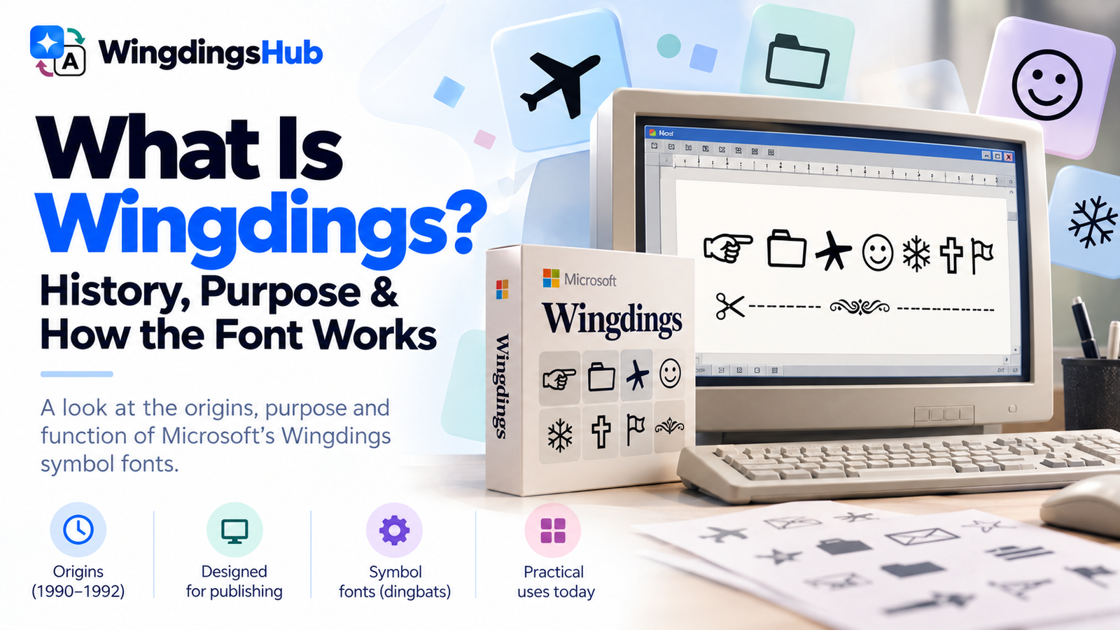
Wingdings is a family of symbol fonts designed by Kris Holmes and Charles Bigelow in 1990 and 1991 and released by Microsoft in 1992. Instead of displaying ordinary letters at many character positions, the fonts show pictorial glyphs such as hands, arrows, office objects, geometric marks, signs, and ornaments.
The unusual appearance has made Wingdings famous as a way to make text look coded, but that was not its original purpose. Wingdings grew out of a much more practical problem: early computer users needed convenient, scalable symbols they could place inside documents and graphical interfaces without managing a separate image for every small icon.
Why Wingdings Was Created
Wingdings belongs to the typographic tradition of dingbats, a term used for decorative or functional symbols set alongside text. Printers had used such marks long before personal computers. Pointing hands, flowers, stars, ornaments, dividers, and other small graphics could guide a reader, decorate a page, or communicate something that did not require a word.
Moving those ideas into digital publishing created an obvious advantage. A symbol stored as part of a font could be inserted much like a letter. It could be resized, printed, aligned with surrounding text, and reused without preparing a separate graphic file every time.
Kris Holmes has described dingbats as symbols used with text for tasks such as showing where to cut, as well as for borders and decoration. Charles Bigelow has described Wingdings more broadly as capable of being informational, expressive, or decorative depending on how a designer uses the symbols.
That background explains why the fonts contain such a varied collection. A pair of scissors, pointing hand, envelope, folder, arrow, star, religious symbol, geometric shape, and decorative flourish may appear unrelated if Wingdings is treated as an alphabet. They make much more sense as a visual toolbox for publishing and interface design.
From Lucida Symbols to Microsoft Wingdings
Wingdings did not begin under the name Wingdings.
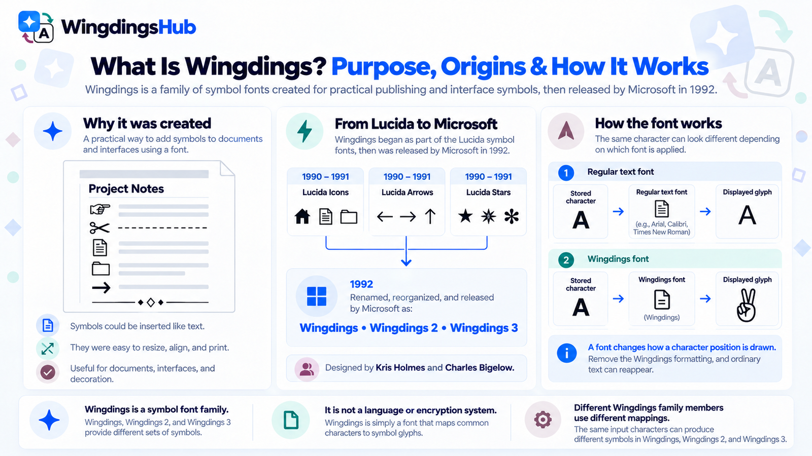
Holmes and Bigelow created the original symbol collections to complement their Lucida typefaces. The sets were organized as Lucida Icons, Lucida Arrows, and Lucida Stars. Their proportions were designed to work visually with Lucida Sans and Lucida Bright, helping symbols sit beside ordinary text without appearing obviously too small, too light, or disconnected from the surrounding typography.
Microsoft later reorganized and renamed the collections and released them in 1992 as three fonts: Wingdings, Wingdings 2, and Wingdings 3.
| Period | What Happened |
|---|---|
| 1990–1991 | Kris Holmes and Charles Bigelow design the symbol sets originally organized as Lucida Icons, Lucida Arrows, and Lucida Stars. |
| 1992 | The collections are renamed, reorganized, and released by Microsoft as Wingdings, Wingdings 2, and Wingdings 3. |
| Windows 3.1 | Microsoft’s current font records list Wingdings version 1.00 among the fonts supplied with Windows 3.1. |
| Later Windows releases | The family continues through successive Windows generations and remains listed for modern Windows versions. |
Microsoft’s description of the family reflects its early-computing context. The fonts include representations of monitors, keyboards, mice, disks, printers, folders, documents, mail, clipboards, windows, and other objects associated with personal computers and graphical interfaces. Those sit alongside much older symbolic forms such as hands, weather signs, astrological marks, ornaments, flowers, and geometric shapes.
What a Wingdings Font Actually Does
The easiest way to understand Wingdings technically is to separate a character from the glyph used to draw it.
A document stores character information. A font supplies the visible shapes used to represent those positions on screen or on paper. In an ordinary alphabetic font, a character position may display the familiar shape of a Latin letter. Apply a symbol font to the corresponding position and the visible glyph can instead be a hand, arrow, folder, face, or another pictogram.
| Part | Role |
|---|---|
| Input character | The keyboard character or encoded position being used. |
| Font | The collection of glyph designs chosen to display those positions. |
| Glyph | The visible drawing displayed by the selected font. |
This mechanism is the reason old Wingdings text can sometimes reveal ordinary characters when its font formatting is removed. The symbol may have been the glyph used to display an underlying mapped position rather than a completely independent piece of picture data.
It also explains why Wingdings itself is not a language or a form of secure encryption. The fonts provide symbol mappings; they do not introduce grammar, vocabulary, or a cryptographic key.
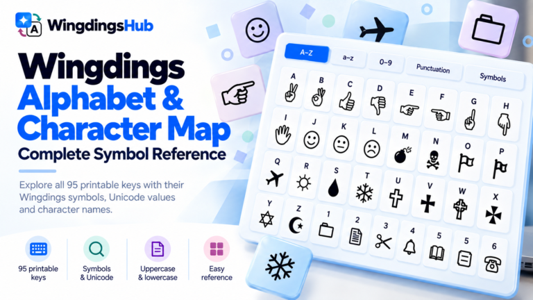
You can test those mappings with the Wingdings Translator, while the Wingdings Alphabet & Character Map provides a full key-by-key reference.
Why Microsoft Released Three Wingdings Fonts
The name “Wingdings” is often used casually for the whole family, but Microsoft released three related fonts rather than one enormous symbol set.
The original Wingdings contains a broad mixture of pictograms, interface-related imagery, traditional symbols, hands, signs, and decorative forms. Wingdings 2 adds another collection of indicators, enclosed characters, hands, writing-related forms, boxes, and other symbols. Wingdings 3 is dominated by arrows and directional marks.
The important point is not simply that the three fonts look different. Their character mappings differ. The same keyboard position does not represent one universal Wingdings concept rendered in three artistic styles.
This becomes especially important when an old document or symbol string needs to be identified. Using the wrong family member can produce a completely different set of glyphs.
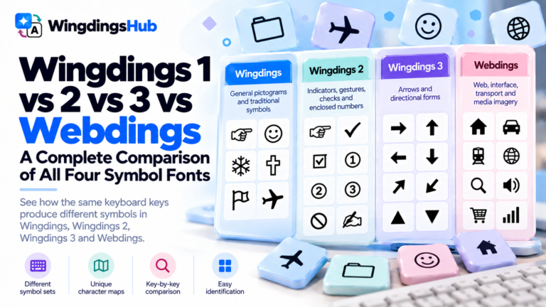
Webdings is a separate font with its own character mapping, designed in 1997 for web-oriented graphics. A side-by-side breakdown is in Wingdings 1 vs Wingdings 2 vs Wingdings 3 vs Webdings.
Why Wingdings Symbols Can Look Like They Have Hidden Meanings
Pictorial symbols invite interpretation in a way ordinary letterforms usually do not.
If someone sees the letters N, Y, and C, they normally read them as letters. If those same character positions display a skull-and-crossbones, a religious symbol, and a hand gesture, the viewer is much more likely to ask whether the pictures form an intentional message.
That tendency helped create one of the earliest Wingdings controversies.
In 1992, attention was drawn to the way the uppercase sequence NYC appeared when displayed in Wingdings. The glyph sequence was interpreted as a skull-and-crossbones, a Star of David, and a positive hand gesture. The combination led to claims that the font contained an intentionally hostile message.
Microsoft responded publicly on April 29, 1992, stating that the Wingdings fonts contained no hidden messages and no intended hate messages against religious or ethnic groups.
The episode demonstrates the difference between a symbol’s appearance and the character position behind it. Three visually suggestive glyphs can form an apparent narrative even when the sequence exists because three ordinary character positions happen to select those drawings.
That same pattern later encouraged people to test names, places, and phrases for surprising Wingdings combinations. The practice helped give the font its “secret code” reputation, even though Wingdings was designed as a symbol typeface rather than a cipher.
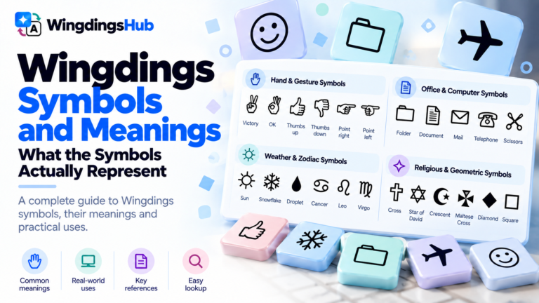
The individual pictures do have recognizable visual meanings, and Wingdings Symbols and Meanings catalogs them.
What Changed When Wingdings Met Unicode?
Wingdings was created before many of its pictograms had standardized Unicode equivalents. As Unicode expanded, characters originating in widely used legacy symbol fonts such as Wingdings and Webdings were encoded across several symbol blocks.
That development did not turn the original Wingdings font into Unicode. It created standardized character identities for many symbols that had previously depended on legacy symbol-font mappings.
Font-formatted text and Unicode symbols behave differently when copied between apps; Wingdings and Unicode: Why Copy & Paste Works Differently covers what survives.
Wingdings Did Not Disappear With 1990s Computing
Wingdings is closely associated with the Windows 3.1 era, but the font did not end there. Microsoft’s current typography records list it across later Windows releases, including Windows 11, and identify it as available within Office applications.
Its practical environment has changed considerably.
Modern software offers many ways to add graphics and symbols that did not exist when Wingdings was created: large Unicode repertoires, emoji, SVG graphics, dedicated icon libraries, vector artwork, and application-specific interface systems. A symbol font is no longer the only convenient way to place scalable pictograms beside text.
Wingdings nevertheless remains relevant for several reasons. Existing documents still use it. Office users still encounter its characters. Typographers study it as part of the history of digital symbol fonts. Puzzle makers exploit its unusual appearance. Internet culture has repeatedly rediscovered it.
A particularly visible modern association comes from Undertale, where material linked with W.D. Gaster helped introduce Wingdings to users who had never encountered the font through desktop publishing. W.D. Gaster and Wingdings: The Undertale Connection Explained examines the documented connection and the fan interpretations around it.
Users who want the original font inside common applications rather than an online conversion can follow How to Type and Use Wingdings in Word, Excel, Google Docs, Windows & Mac.